Banno Content
Managing a website is hard. There’s a reason entire companies are dedicated to building and maintaining your online presence, but Banno Content helps to cut out the middleman. Powerful, intuitive tools allow your team to take your content into your own hands. Whether you’re simply snazzing up your visuals or preparing to launch a whole new product, Content is build from the ground up specifically for FIs, so your job will be quick, easy, and tailored to you.
How does it work?
The Banno Content app has a wealth of intuitive features, from simple-to-use editors to robust scheduled publishing. From serving up information to gathering it with forms, Content has the features you need to create your best possible website.
Training Videos
Banno Content makes maintaining your website easy, but it’s still a big job. There are a lot of moving parts, and it can be tricky to keep track of. But don’t sweat it! We’re here to help. Our training videos will teach you how to do everything from managing forms to publishing a brand new page. Want to learn more? Check ’em out below!
Assets
Form builder
Forms
Locations
Marketing
Menus
Pages
Rates
Settings
Users
Imagery Guidelines
Imagery – whether illustration or photography – is your first visual impression on your user. Not only does it set the tone of voice for your institution, it reaches the user on a personal level. It’s a subtle language between you and your users that can be used for calls to action or brand support.
Our team takes this deeply into consideration when designing your website, and we want to provide you with the same tips we use when choosing imagery. This will help you keep the original look and feel of your website as well as uphold the integrity of the design over time. We’re in this with you – for the long haul!
Choosing imagery
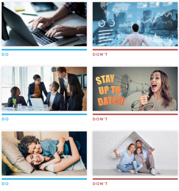
Use imagery to express a distinctive voice and exemplify creative excellence. Photographic stock and clip art is neither specific nor interpretive. Before choosing imagery, ask yourself a few things:
Is it emotionally authentic?
No matter what emotion or feeling you’re trying to capture, make sure it strikes a good balance of being both straightforward and subtle.
Is it happening in a real place?
Too many stock photos take place in an empty white space. In real life, there are no blank white backdrops. Things happen in living rooms, parks, shops and offices.
Do these people look convincing?
Before choosing an image, ask yourself if the people in the photo feel like real people. Can you imagine seeing them in your everyday life? Are they someone you’d come across at a neighborhood cafe, in your office, or on the bus? Are they feeling something you’ve felt? A good stock photo conveys these things.
Things to avoid:
- Using cliché or overused photos
- Creating bad clipping paths and/or marks
- Using photos unrelated to your content
- Buying the low resolution version because it’s cheaper
- Using imagery that looks outdated or non-professional
- Using pictures that look over-posed
- Using images with text (this will not be picked up by SEO and may not be legible as images respond to smaller viewports)
Tips and tricks
- Prior to uploading your images to the CMS, we recommend you crop, resize, and/or compress images using an image-editing application, such as Adobe Photoshop.
- Please note, you can find exact sizes for each of the image styles used on your website in your institution’s style guide, provided during your implementation.
- To maintain site speed and avoid increased loading time, we recommend assets uploaded to the CMS do not exceed 300kb.
- Jack Henry™ uses Getty Images to purchase photos. Due to our licensing agreement, assets purchased by Jack Henry during the project are intended to be used only on your Jack Henry website and not for any other purposes.
ADA compliance best practices
- Do not use photos with text for advertisement purposes. Text placed on an image is not ideal for responsive design, cannot be guaranteed to show on all viewports, and is not ADA compliant. Text graphically placed on images cannot be read by screen readers and, therefore, will go unnoticed by visually impaired visitors.
- When uploading images to the CMS, enter a brief image description. This will be used by screen readers for a visually impaired user.
- When saving your assets prior to upload, do not use spaces in your file names. Instead, use hyphens or underscores, if needed.
For a more in-depth guide to our tips and best practices for ADA compliance on your website, see our ADA compliance guide.
Reverting Pages
Sometimes you make mistakes. You push an update live before it’s ready, or you let a typo slip through the cracks, or you just save content to the wrong page. It happens to everyone! Luckily, it’s easy to revert changes to your pages with Banno Content. See the full details below.
How to revert
Reverting a change is simple. From the Pages screen in Content, find the page you’d like to revert and select View History. From this view, any updates to content that you can revert to are marked with a Revert to this version of your page icon, which sends you to the page editor with the content from that version automatically filled in. From there, simply save and/or publish your page to revert to the older version.
How it works
Revert acts on the content of your page, rather than the page as a whole. This means you won’t lose new content areas that you’ve created after the version you’d like to revert to. Content areas will simply revert to the oldest version available between its current version and the version you’re reverting the page to.
This means that reversions look like any other edit to the content of your page. The version you reverted from is saved in the history of the page in case you need that content back later.
Shared content areas are also reverted. This means that the content area reverts for all other pages that use the shared content area. If this is not preferable, select Remove from group on the shared content area to separate it from other pages.
Compliance Best Practices
The Banno team strives to meet the Americans with Disabilities Act (ADA) compliance standards during the entire life of your implementation project – beginning in design, through the development process, and during content placement – in order to create an easily accessible experience for all users. There are many things we can do to help get you started on the right path, but because you have the flexibility to manage your website through Banno Content, much of the work will be in your hands as you work to keep our site up-to-date over time. Below, you can find tips and best practices to keep in mind when making updates to your site content. This will help ensure you stay within the standards of ADA compliance.
Page setup
- When creating pages within Banno Content, no two pages should have the same page title to ensure users with screen readers can recognize the difference.
- For example, if you have a Checking page set up within your Personal and Business menus, the page title for each page cannot be Checking. Alter one or both page titles to ensure there is no duplication (e.g. Personal Checking and Business Checking).
- All SEO titles set for individual pages must be unique. Do not duplicate these across different pages of the site.
Heading styles
- There should be only one Heading Style 1 (H1) element per page. When a page is created, the title of that page automatically uses the H1 element. When formatting your page content, all other headings should use H2-H6.
- When using heading styles within page content, make sure to use them hierarchically and in descending order (e.g. H2, H3, H4, etc.). You can reuse groupings of headings H2–H6 within page content as long as they are always in descending order. This format is similar to how you write an outline.
- When using descending headings, do not skip heading style levels. It is, however, okay to skip up style levels when closing subsections.
- For example, an H2 beginning a new section can follow an H4 because it closes the previous section. However, you cannot have an H5 directly follow an H2, as that skips a level.
| Do - Example | Don’t - Example |
|---|---|
| Heading 1 (Page Title) | Heading 1 (Page Title) |
| Heading 2 Example section heading |
Heading 2 Example section heading |
| Heading 3 Example paragraph text |
Heading 5 Example paragraph text |
| Heading 4 Example paragraph text |
Heading 3 Example paragraph text |
| Heading 2 Example section heading |
- The text of each heading must be unique from all other headings within a single page.
- For example, if you name a page Security Tips (which automatically places that text in an H1 element), you should not also have another heading on that page using any heading style that reads Security Tips alone. If the subheading says Security Tips and Tricks, this is acceptably different.
- Ads within your website content should always include Heading Style 2 (H2) as the first heading.
- For headings within tables, use table heading cells (
<th>), not standard heading tags (<h1>,<h2>, etc.). These styles are set automatically for you when your website is built and applied as you enter content into a table created through Banno Content.
Typography
- It’s best not to copy and paste content into the editor unless you are pasting plaintext from a simple text editor, such as Notepad or TextEdit. Copying text directly from Microsoft Word or another webpage can copy in offending styles from these other locations, causing many problems inside the code that you may not immediately see. If you do need to copy text into the editor, you will have the option to right click and select Paste as plain text to avoid potential issues with site formatting from external styles being copied into the site.
- Use only the styles available to you within the toolbar of the Banno Content editor, as the site is built with font styles and colors that are ADA compliant. Many colors and styles do not pass ADA requirements. Using inline styles within the CMS source code editor to alter the colors and styles set for your site may cause you to fall out of compliance with ADA standards.
- For emphasis, bold and italicize your content using the editor toolbar available in the CMS, as these styles are in compliance with ADA guidelines. Using bold, italics, or strikethrough HTML code through the CMS source code editor is not recommended, as these tags have been deprecated.
- For example, Guidelines indicate to apply italics with emphasis (
<em>) and boldness with strong emphasis (<strong>), which are set by default within the CMS. If you are editing through the source code editor and apply your own bold (<b>), italics (<i>), or strikethrough (<s>) formatting, this will fall outside of ADA compliance.
- For example, Guidelines indicate to apply italics with emphasis (
- Throughout your website content, only linked content should be underlined. Underlines will be added automatically to links by your site’s built-in styles. Do not use the CMS source code editor to underline content.
- Use bold, italicize, and underline sparingly. Long strings of text within these tags will be flagged.
Hyperlinks
- On calls to action, use descriptive wording that includes the purpose or link destination, so the end user can understand what action would be taken by clicking the link.
- For example, instead of Learn More, try phrasing as Learn more about savings accounts. Other calls-to-action that should include additional descriptive text include: Click here, Find out more, Get started, Try it now.
- Keep the linked text as short as possible while remaining descriptive. Links opening in the same window should include fewer than 80 characters; links opening in a new window should include fewer than 55 characters. Shorter links are easier for screen readers to scan. They are also easier for assistive technology to use.
- Avoid placing two links that point to the same location back-to-back, as this causes screen readers to sound as though they are stuttering.
- For example, when an image sits above text that will link to the same location, these often get linked at the same time. You should not have these set back-to-back, linking directly to the same place with the same description.
Imagery
- When naming your files, avoid space characters. Instead, use underscore or hyphen to separate words, if needed.
- All assets must include a description that a screen reader will read for a visually impaired user. The Description field for the asset allows any text to be entered, and it is important to describe what you see in the image or a brief description of what the asset itself is. The description field should include fewer than 100 characters.
- Example: “A smiling girl playing on a swingset during a sunny afternoon.”
- When adding description text to an asset, do not duplicate the file name.
- For example, if the description text (read aloud by screen readers) is “checkmark,” the filename cannot be “checkmark.jpg”. Change the filename to something else, like “brand-checkmark.jpg.”
- The description text for an asset should not include a color.
- Images that contain text, are alone inside a hyperlink with no additional text, or indicate a visual marker to be read aloud (e.g., checkmarks in a table), need a description outlining the image, text, or link details for screen readers.
- Please note, photos with text placed on the image should not be used. Text on images is not ideal for responsive design, cannot be guaranteed to show on all viewports, will be undetected during any type of ADA scan, and will not be picked up by SEO.
Tables
- Heading styles (H1-H6) should not be used inside of tables. During the design and development of your website, title headings are created for the tables on your site. They are automatically included in the table styling or can be defined in the source code as
<th>. - Hex values should not be used within the CMS source code editor to color the cells of your tables. Many colors and styles do not pass ADA requirements, and altering the colors and styles set for your site may cause you to fall out of compliance with ADA standards.
Embedded content
- Ensure that any iframe content you embed within your site is ADA compliant by adding a title attribute for screen readers. Use these instructions to add
title= attributeto the source code for embedded iframe content.- After having added an iframe to a page, select in the editor toolbar.
- Select < > Source code in the dropdown menu.
- In the HTML view, add a “[titlename]” value after
title=in the iframe section of the code. - Example:
<iframe title="BillPay video"src="https://www.youtube.com/embed/XXXXXX" width="500" height="300" frameborder="0" allowfullscreen=""></iframe>
Want to learn more about ADA and WCAG Compliance?
Gain an overview of the current Web Content Accessibility Guidelines.
FAQ: Banno Content
- Why do I sometimes have to reauthenticate?
- For your security, you will be asked to reauthenticate every 8 hours and after periods of inactivity. For more info, see session timeouts.
FAQ: Reverting Pages
- How far back in history can we revert a page?
- The revert option appears only on the history for an individual page, which contains the last 20 modifications to the page. Pages cannot be automatically reverted to versions older than 20 revisions.