iOS App UX Design Evolution
The Banno Mobile app on iOS is currently undergoing an incremental user experience (UX) design overhaul to reflect Apple’s new Liquid Glass design system, which all iOS apps must adopt by 2026. To ensure a high-performing experience and better prepare financial institutions and accountholders for the modernized UX, Jack Henry is working to introduce the required changes in a series of releases – Banno Mobile versions 3.29 through 3.33.
The sections below provide an overview of the changes to date and those planned with each release.
Mobile 3.29
ShippedReleased on Thursday, November 13, 2025, Banno Mobile 3.29 on iOS included the first of many noteworthy UX updates.
This release established the modernized UI for the navigation bar across the app. Improving the navigation involved the following changes, which better align with native patterns and system theming:
- Custom toolbar options have been removed.
- Toolbar buttons now reflect the body text theme color.
- Labels now reflect the system’s primary color.
Mobile 3.30
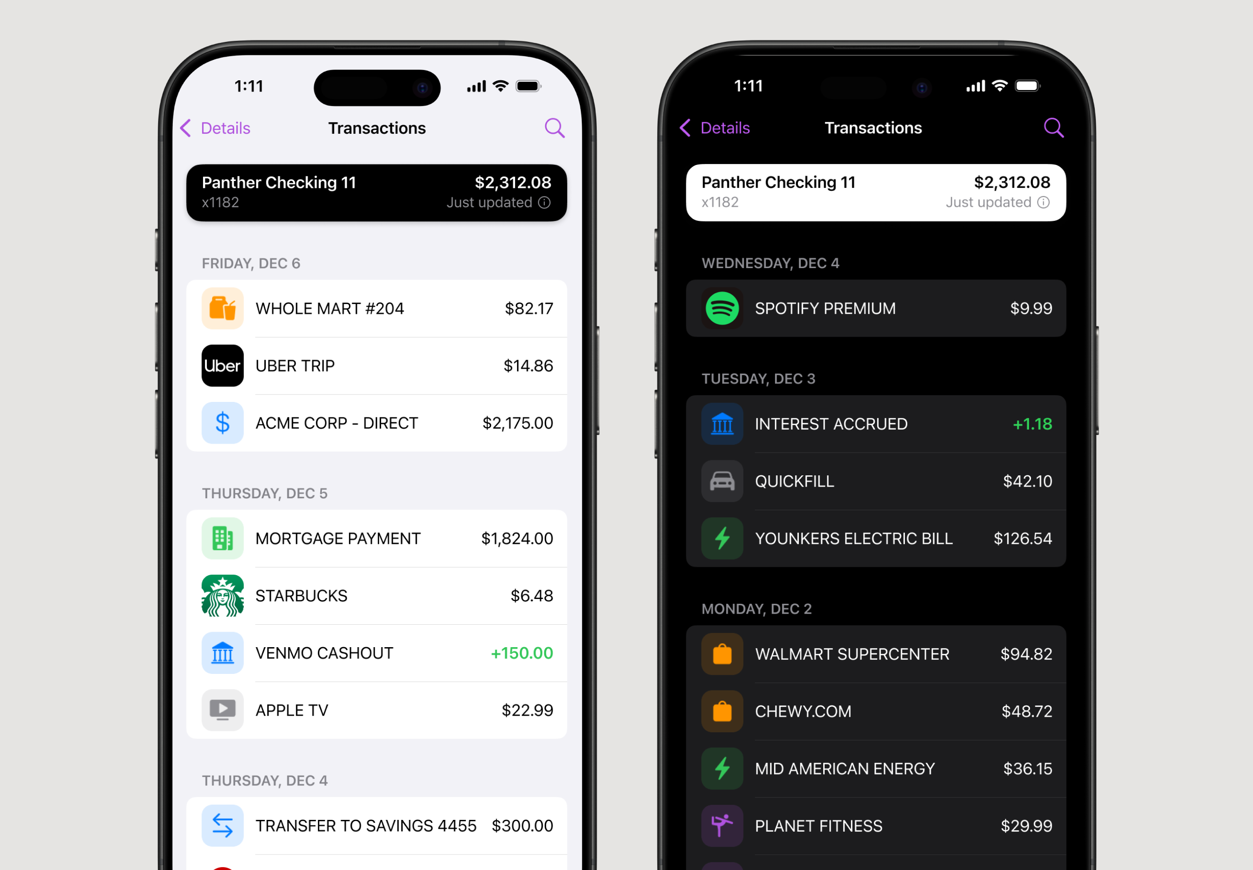
ShippedSubmitted to the App Store on Tuesday, December 9, 2025, Banno Mobile 3.30 on iOS included adjusted colors for backgrounds and text. In both cases, the changes align to the new standard system colors for these elements, as shown in the preview below. Note that Apple must complete its reviews before the new version is available in the App Store; the review process can take a few days.

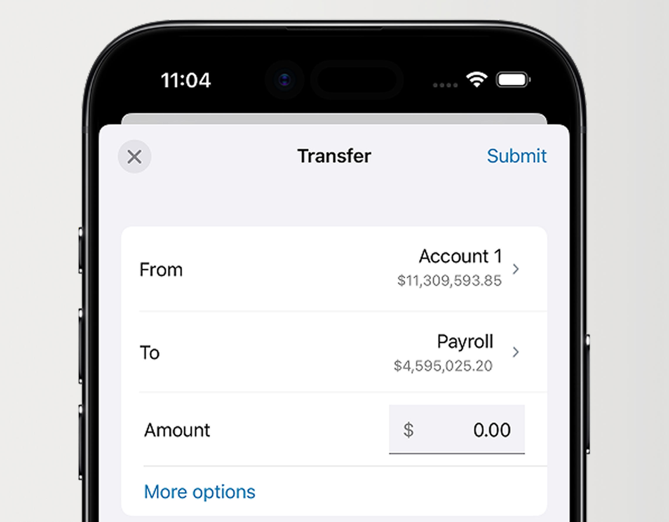
Additionally, end users will notice new styles when dismissing screens, as we have transitioned to the new system close button – an xmark enclosed in a circle. In previous versions of the app, users have tapped words like cancel, close, and done to dismiss screens.
Mobile 3.31
BuildingIn Banno Mobile 3.31, we will continue adjusting our color usage to be more purposeful. This will include less obvious changes, like the dividers used to separate accounts, and more visible changes, like section titles.

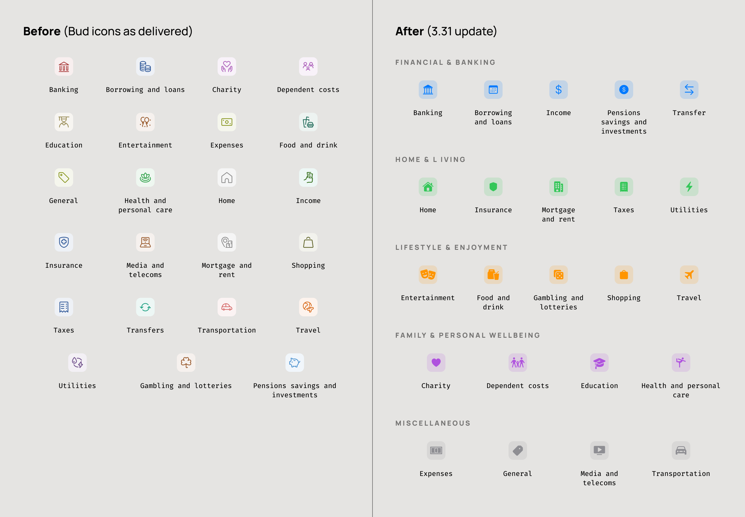
This version will also introduce the adoption of Apple’s SF Symbols, which replaces our existing Banno icon library. The latest version, SF Symbols 7, provides additional flexibility with built-in animations and icon styles. In the future, we will leverage these advantages to enhance brand identity in the app.
Category Icon Updates
As part of release 3.31, we are also updating how spending categories sourced from Bud Financial are visually represented in the app. Bud will continue to classify transactions and categories, but the presentation of those categories is being redesigned to align with the rest of the Banno Mobile experience.

These updates include:
- New SF Symbol icons for iOS to create a more native and cohesive visual experience
- Standardized color-grouped categories to make lists easier to interpret
- Improved accessibility through platform-native scaling, dark mode support, and high-contrast compatability
- No changes to Bud’s underlying data or category logic; this enhancement affects UI presentation only
A similar update will be introduced for Android in a future release, where we will adopt Material 3 icons and color guidance to maintain cross-platform parity.

Mobile 3.32 - 3.33
BuildingOur previously communicated timeline has shifted just slightly for our iOS app. Now, Banno Mobile 3.32 will wrap much of our early preparations for Liquid Glass, and Mobile 3.33 will mark the completion of that early prep work. Over the course of the two releases, the screens used to initiate money movement will be transitioned to a consistent layout style, and we will address inconsistencies with how this type of content is presented throughout the app.

When moving money, accountholders will notice UX enhancements to all related forms – whether making an internal or external transfer, sending a wire, or anything else related to money movement. Mobile 3.32 and 3.33 will unify the look and feel of form inputs, such as text fields (as seen in Figure 5, above) and date selection, as well as introduce improved animations used for presentation and dismissal of forms.
Mobile 3.34
RadarBanno Mobile 3.34 will start to introduce larger structural changes to content. Search will see an overhaul in this release, moving from the navigation bar to the primary content area. This change ensures that when we enable Liquid Glass, the search UI automatically moves to the bottom toolbar, as expected. This means we also have to address how we expose filtering, which was previously tied closely to search. Filters will move to the navigation bar prior to Liquid Glass, after which they will move to the bottom toolbar, right next to search.
This release will also introduce consistent layout styles for landing and detail screens alike. We will address inconsistencies with how we present these screens as well, so accountholders can start relying on a cohesive experience throughout the app.